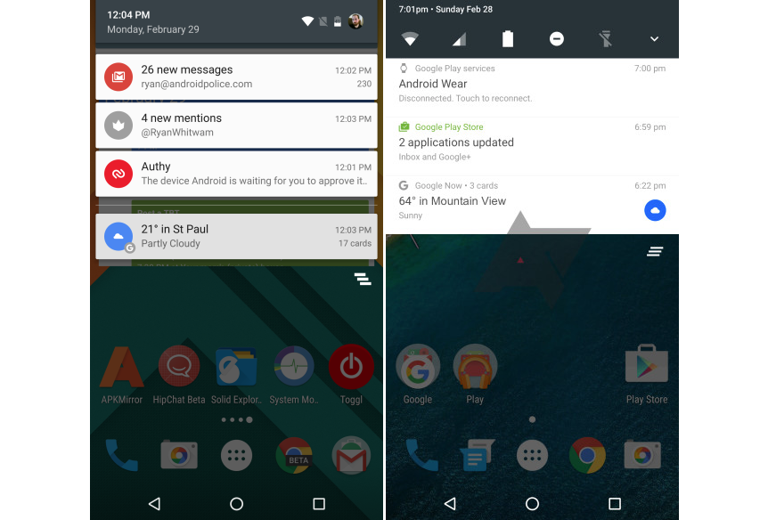
Android N is shown for the first time in a screenshot
A video released on Twitter shows Android fans the possible lack of an app drawer in the next version of the system, as Android N might not have the Application menu. New rumors coming from the network also speak of a hypothetical design aimed at favoring the disposition to screens just as it does on iOS and MIUI developed by Xiaomi.
Google posted yesterday on its Twitter profile @googlemaps a video to remember the movie Forrest Gump. But it is not what we want to talk about: in fact, the thing that catches the eye of all the Android enthusiasts, is the lack of the app drawer (the application menu) in the version used as an example. This is nothing but a kind of confirmation, in recent days there was much talk of it, and the new version of Android N to be presented in May at the Google I/O. Obviously it is early to give the thing for granted and for sure, but here you could start collecting the first clues, it wanted or not they are from Google, to test the public’s reaction to a possible novelty of the genre.
It would not be the first OS without menus, iOS never had, and even many Chinese customizations of the same Android does not provide a box with all the icons that are scattered as ‘desktop’. Google is no stranger to these jokes, and do not be surprised if it was a considered move and designed specifically for the future version of the green robot, presumably arriving in October 2016.

There are still several months for the Google I/O event, the annual conference for developers, a 3-day completely focused on the ecosystem of the green robot that will be centered in the next distribution of Android. Directly by Google comes a first representation to the Android drop-down menu N (6.1 or 7.0) and is faithfully from a draft version seen in the video.
In the screenshoot we can see how the Mountain View graphics have revised in a minimalist key notifications aside the curtain of the tabbed interface introduced with Google Now. Besides the classic quick toogle top (Wi-Fi, data, battery, do not disturb and flashlight mode), we find an arrow to expand and access other settings quickly. Notifications itself is therefore more readable since enjoy more space and offer more information thanks to a light font, less marked and, above all, reduced than the current one.
